
Indicate changelog
Let AI build your dashboards, Merge data in tables, Dashboard descriptions, YouTube Connector
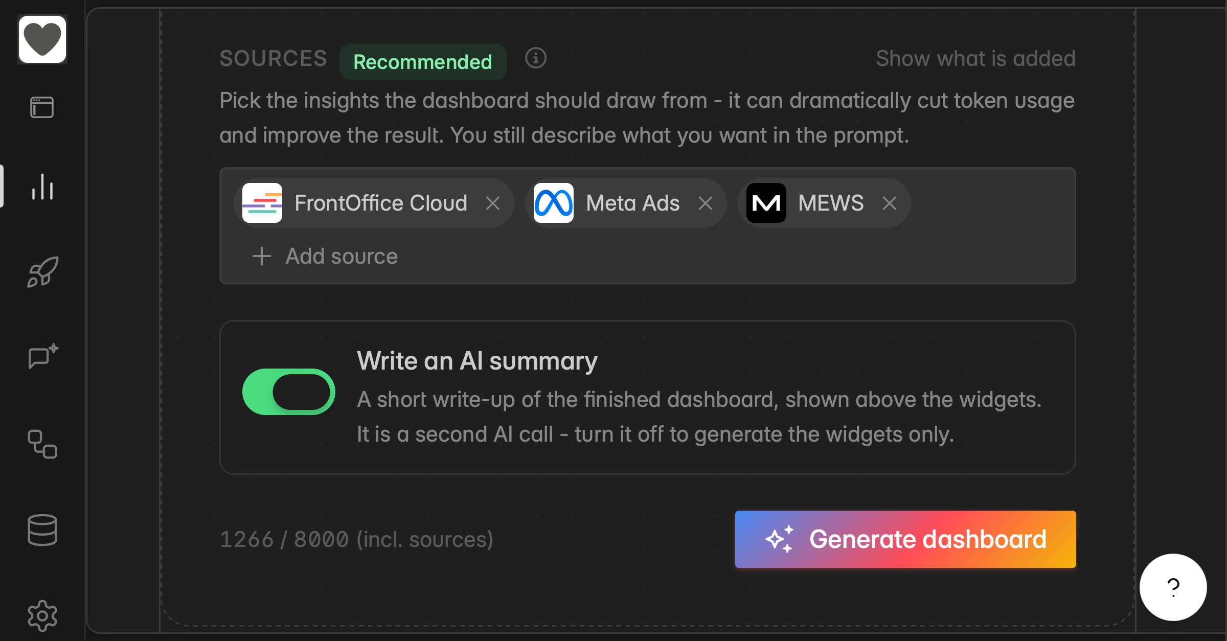
Meet AI in Indicate
Indicate AI can now build, analyse, and explain dashboards for you. Describe what you want and let the AI do the heavy lifting.
Generate a dashboard from a prompt:
Describe the dashboard you want in any language and Indicate AI builds the widgets, their titles, their settings, and their layout. An optional source picker lets you name which data sources to build from for a noticeably better result.
👉 Find more information here.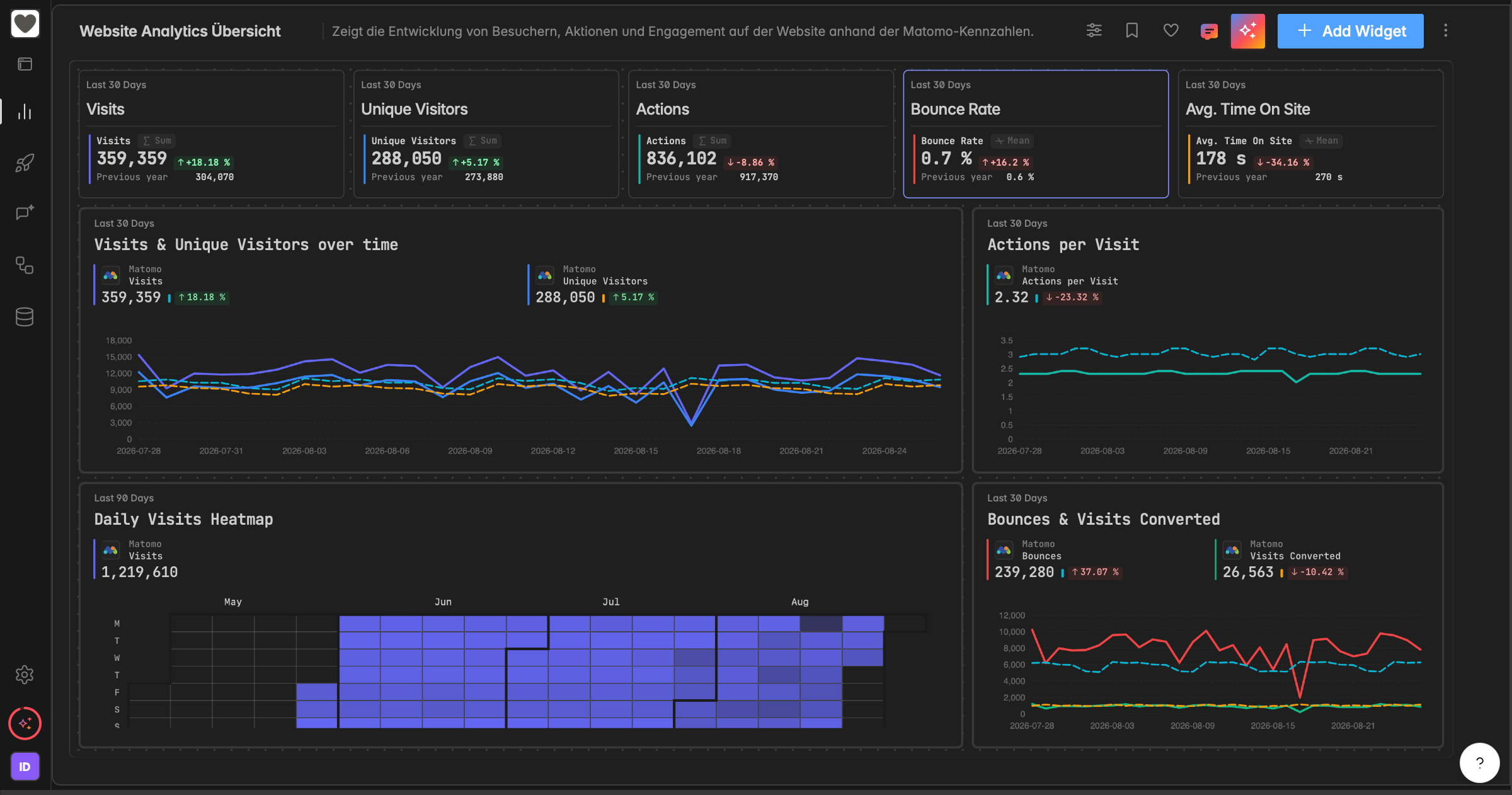
Summarize a dashboard:
Generate an AI summary of the whole dashboard. The summary sits in a collapsible panel above the board.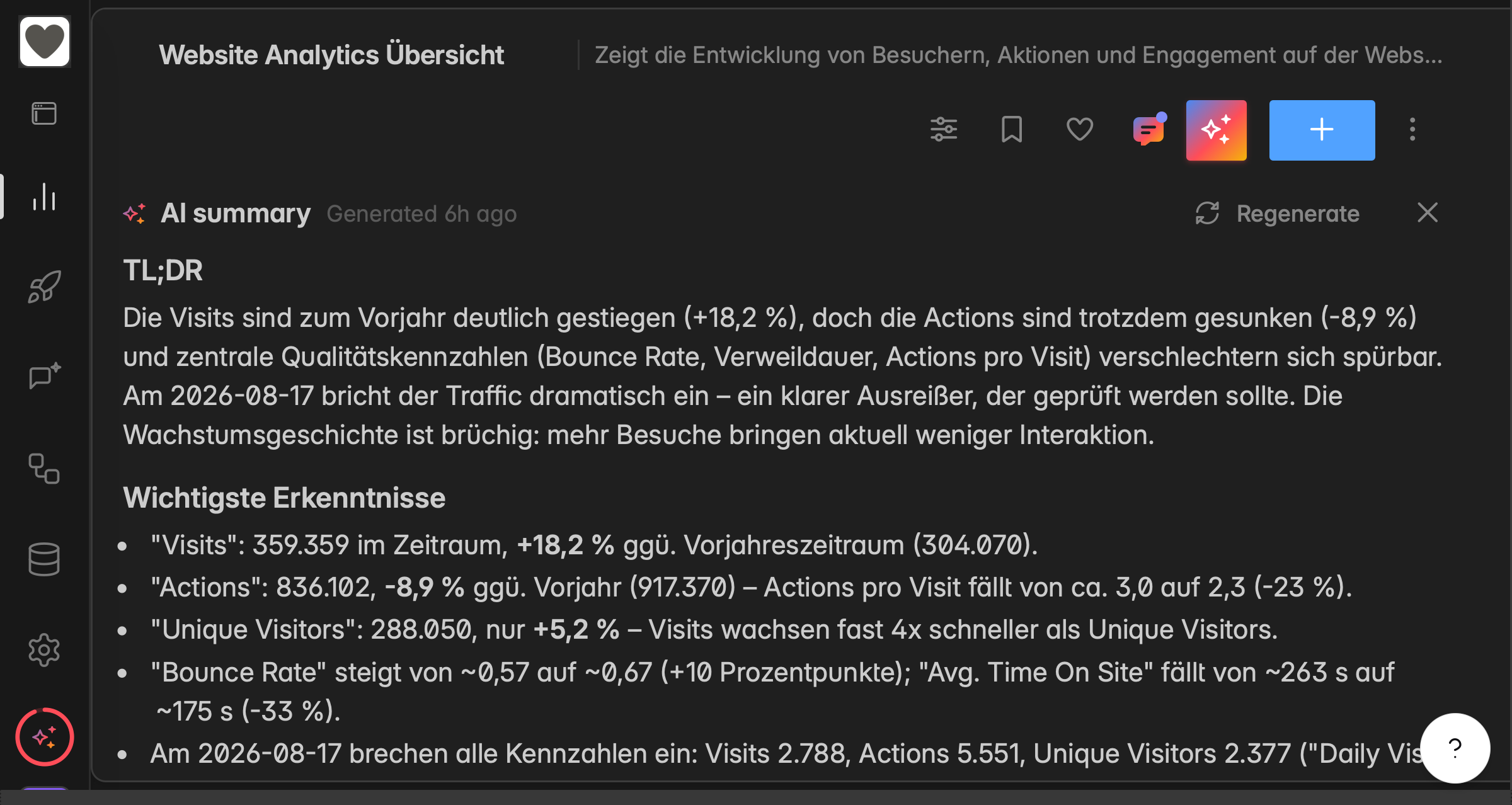
Choose the preferred AI language per space:
Each space picks the preferred language the AI answers. Change the AI output language in the space Settings → General. This steers the AI output, not the interface language.Select the AI model per space:
Each space picks its AI model in Settings → General.
⭐ Free AI Allowance During the Promotion
While the promotion runs, every space on Core plans and above gets a free AI allowance of $5 per 30 days so that you can try the new AI features. Any single person can use up to $10 of AI per 30 days across all their spaces. Both allowances and their reset dates are visible on the usage gauge and the Usage page. Find more information here.
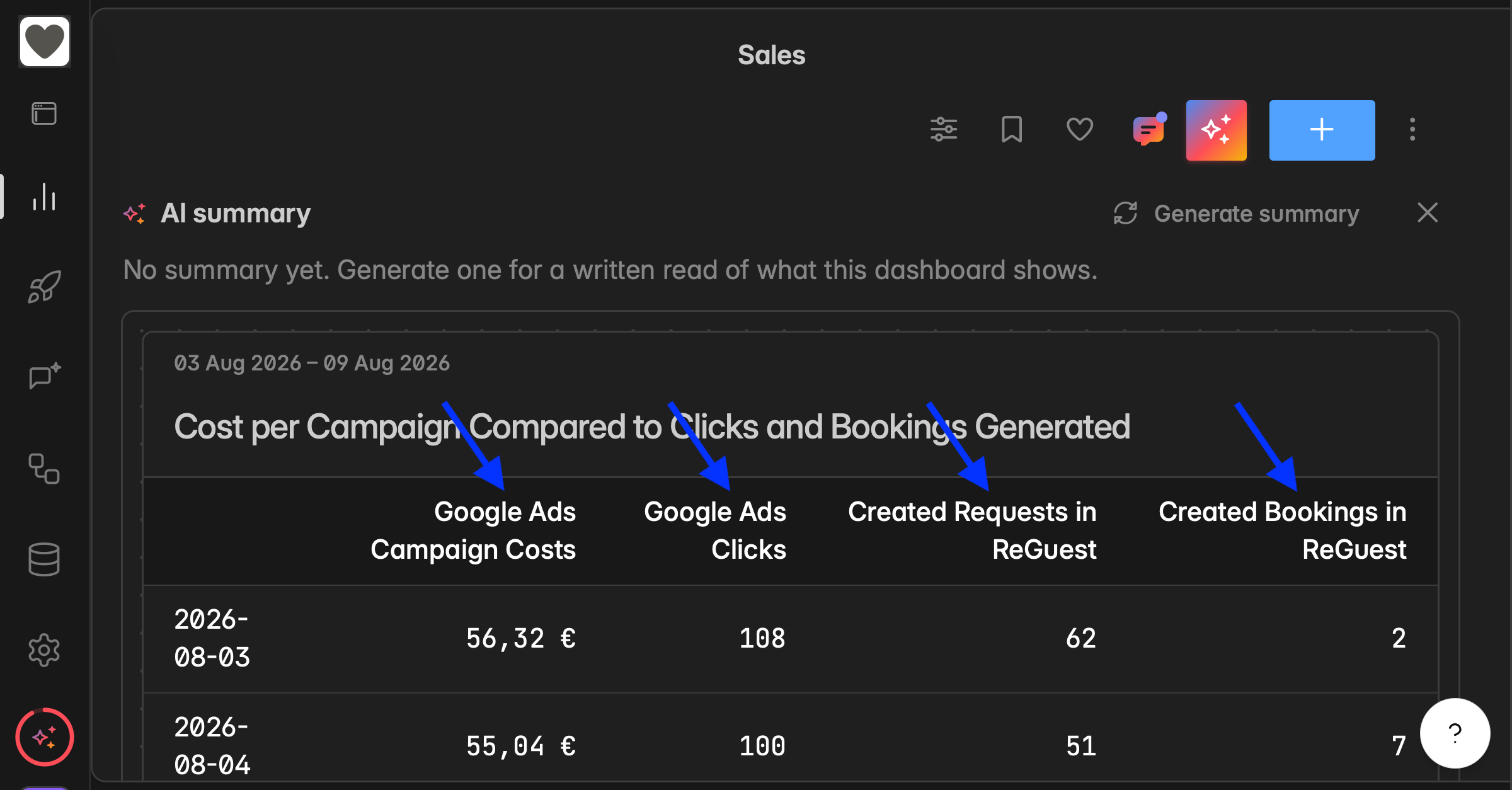
Merge data from multiple sources in table widgets
Widgets now join data from multiple data sources on a shared column, such as date, campaign name, or country.
This already worked for every widget type except tables. We have now extended it to tables as well.
One thing this unlocks: you can evaluate campaigns across different data source systems, as long as they share the same campaign name within their original system.
Tip: setting up your data cleanly in the source system makes this kind of analysis much easier.
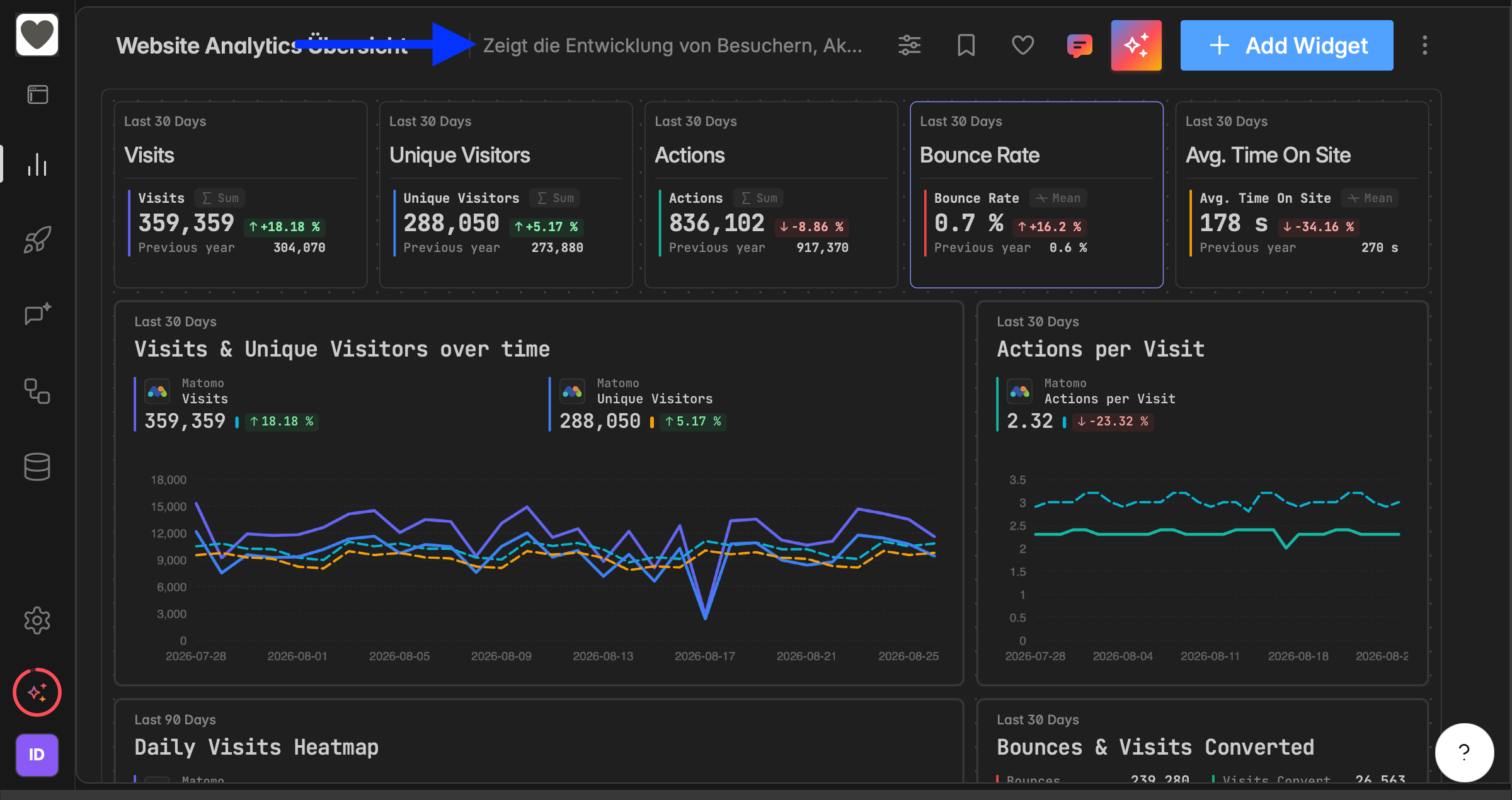
Dashboard Descriptions: Shown Inline in the Header
Dashboards now show their description inline, right next to the dashboard name in the header. Long descriptions are shortened with the full text available on hover.
👉 You can change and edit the description in the ⋮ Dashboard Menu.
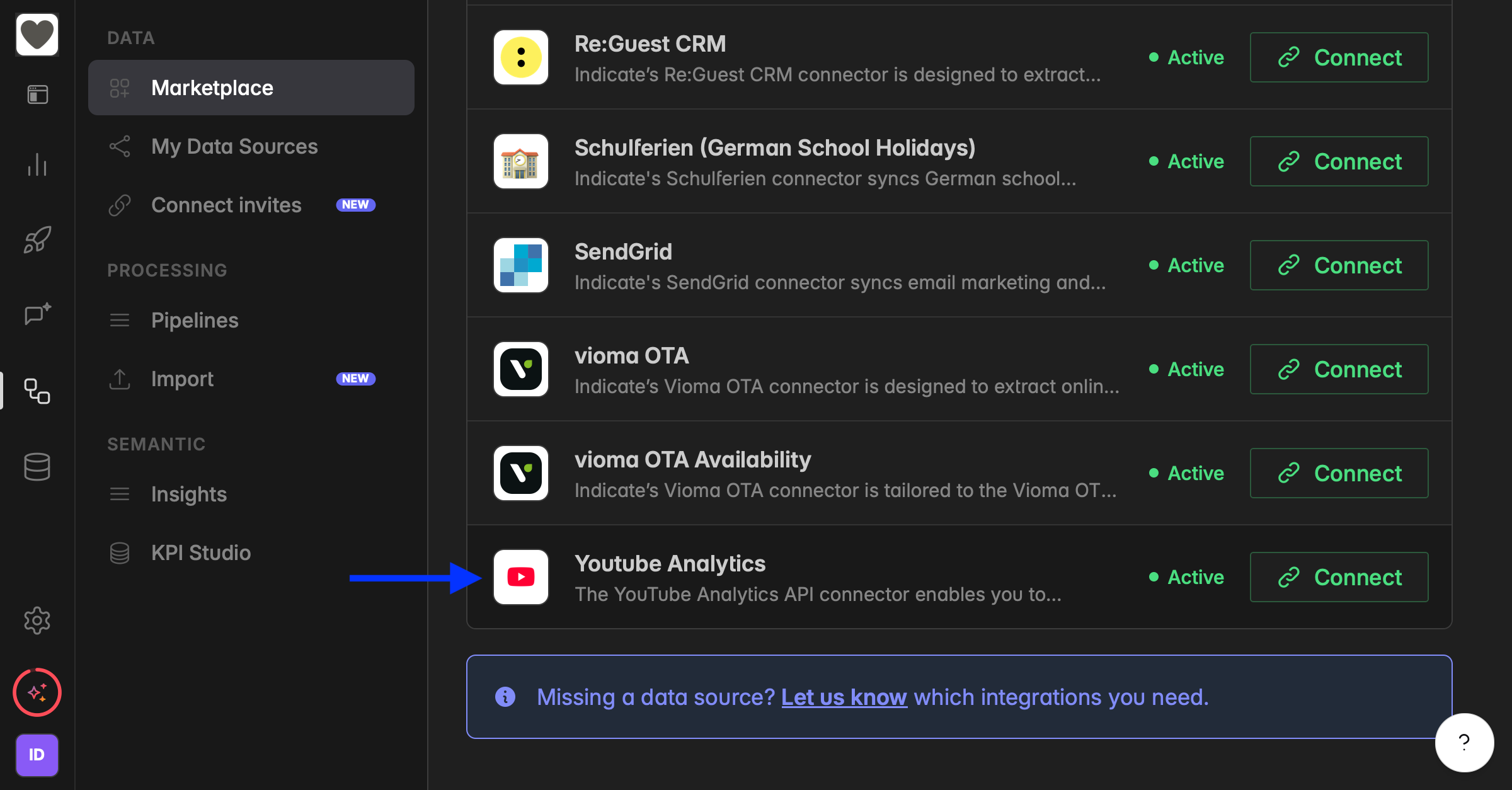
YouTube Analytics Integration: Now Live
The YouTube Analytics integration is live for all. Connect your channel and track your YouTube data in Indicate.
👉 You can find it under Engineering → Marketplace → YouTube Analytics
Fixes and Improvements
Bar chart values now display horizontally so they are easier to read.
Improved dashboard responsiveness so dashboards now adapt more smoothly across screen sizes.