Docs / Widgets
Style a widget
Style a widget: set series colors, hide a series with Ghost Mode, show values, and turn on stacked or smooth.

How do I change colors in a chart?
Metric colors define how your data series appear in a chart. In Indicate, you can easily change colors to match your brand, improve readability, or visually group related data.
You can set colors automatically, use predefined palettes, or define a custom HEX color for complete control.
Each data series can have its own color.
Changing the color affects only the visual appearance, not the data itself.
When using multiple data series in one chart, assign unique colors for clarity.
You can change colors anytime; updates appear instantly across all viewers’ dashboards.
Why do colors matter?
Colors make dashboards easier to interpret and visually consistent.
They help distinguish between multiple data series and make key metrics stand out.
Highlight important trends with strong, consistent colors.
Use brand colors to align visualizations with your company identity.
Improve accessibility by choosing contrasting colors for overlapping data.
How do I change a series color?
Open your dashboard.
Select the widget that contains the metric you want to recolor.
In the widget builder, locate your data series (for example, Total Users).
Click the color icon next to the series name.
Choose one of the following color options:
Auto: lets Indicate assign colors automatically.
Palette: pick from the pre-defined Indicate color sets.
Custom: define your own color using a HEX code (e.g., #007AFF).
Click Save to apply the color.
The new color will immediately appear in the chart legend, lines, and tooltips.
What color options are available?
Auto: Automatically assigns system-generated colors for fast setup.
Palette: Offers pre-selected color combinations designed for contrast and visual balance.
Custom (HEX): Lets you manually enter any color code (for example #FF5733). Ideal for brand alignment or accessibility adjustments.
If you switch to Custom, enter your preferred HEX code in the text field, preview the result, and click Save.
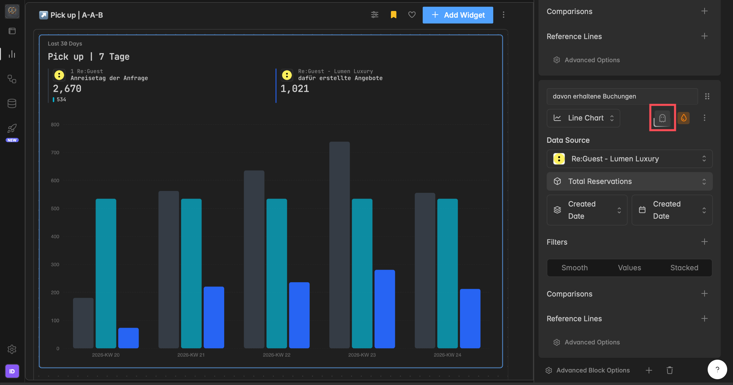
How do I hide a series (Ghost Mode)?
Ghost Mode hides a series from the chart without deleting it, so its color, filters, and settings stay saved. Use it to simplify a chart during a presentation or to hide sensitive data.
In the widget builder, find the series under the Series section.
Click the ghost icon next to the series. It disappears from the chart and the widget header.
Click the ghost icon again to bring it back.
You can ghost as many series as you want, and you can also ghost reference lines and comparisons. The ghost icon stays highlighted while Ghost Mode is active.
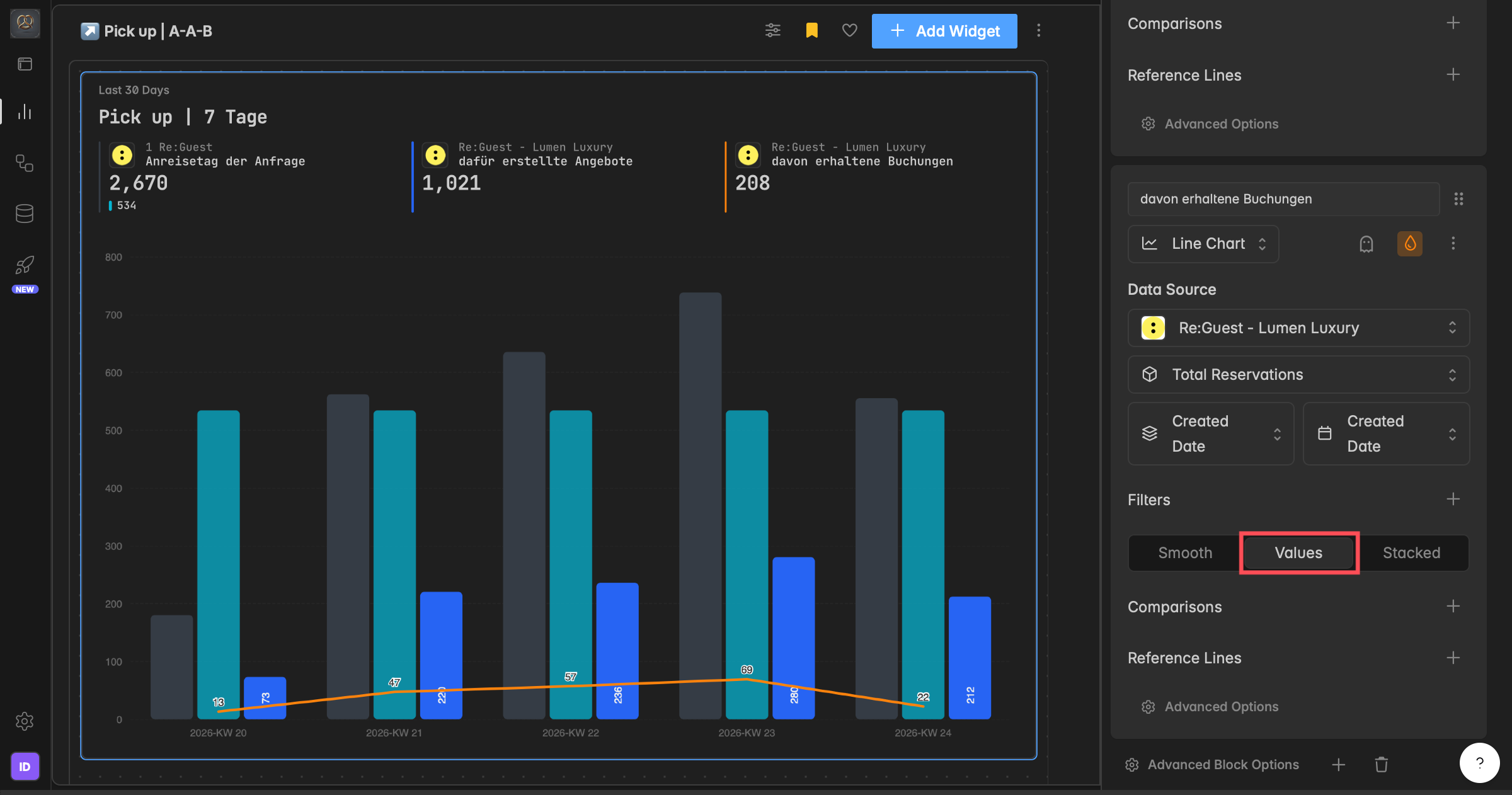
How do I show values on the chart?
The Values toggle shows the exact value on each data point, so you can read precise figures without hovering. It is available for line, area, bar, and column charts.
In the widget builder, find the Values toggle (next to Smooth and Stacked).
Click Values to turn it on or off. The preview updates instantly.
On dense charts with many data points, showing every value can look crowded.
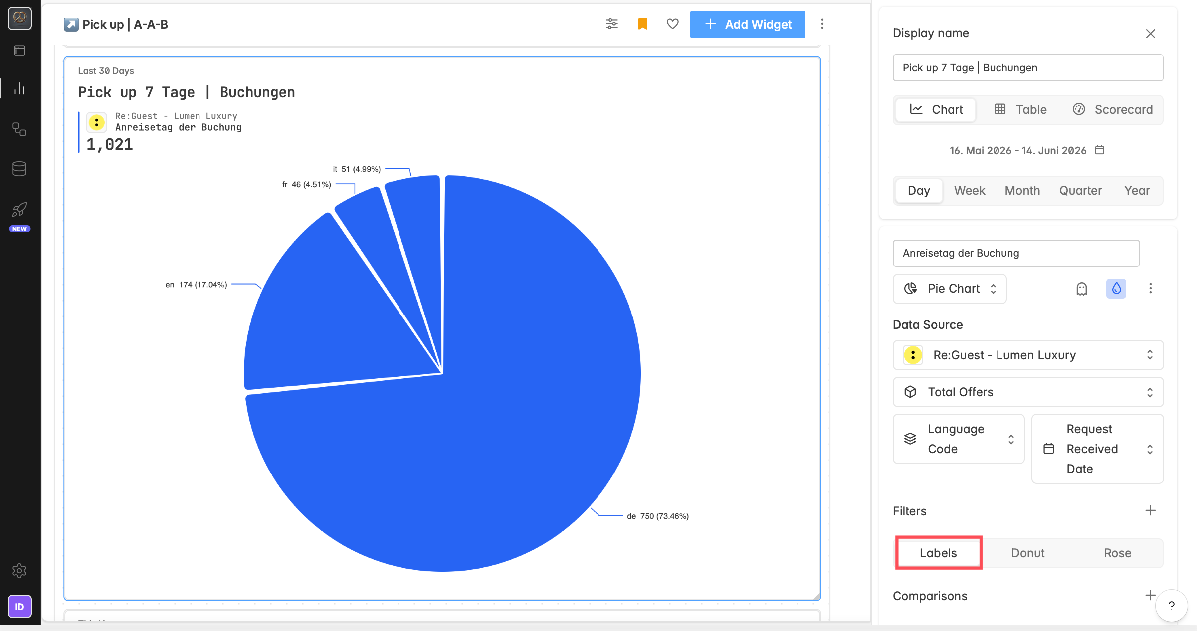
How do I show labels on a pie chart?
For pie charts, Labels show the value or percentage directly on each slice, so you can read it without hovering.
In the widget builder, switch the chart type to Pie.
Find the Labels toggle (it works the same way as Values on other chart types).
Click Labels to turn it on or off. The preview updates instantly.
How do I stack series?
The Stacked option layers multiple series on top of each other so you can see the total volume and how each one contributes. It works for area, bar, column, and line charts.
In the widget builder, find the Stacked toggle (next to Values and Smooth).
Click Stacked to turn it on. You can also define a group name to create stacking groups: series in the same group stack together, and a second group is shown side by side in the same chart.
The preview updates instantly.
Stacking changes how data is displayed, not how it is calculated. You can combine it with Values and Smooth.
How do I smooth a line or area chart?
The Smooth option softens sharp transitions between data points to emphasize the overall trend. It changes only the visual rendering, not your data, and is available for line and area charts.
In the widget builder, find the Smooth toggle (next to Values and Stacked).
Click Smooth to turn it on or off. The change applies instantly in the preview.
Smoothing works best with time-based groupings (Day, Week, Month) and many data points. With only a few points it has little visible effect.
Troubleshooting
My color change didn't apply.
Open the widget builder, click the color icon next to the series, pick Auto, Palette, or Custom (HEX), then click Save. The color updates in the legend, lines, and tooltips.
Two series have the same color.
With Auto, Indicate assigns colors automatically and may repeat them. Set a Palette or Custom color on each series to keep them distinct.
My series disappeared from the chart.
It may be ghosted. A ghosted series is hidden but still saved, and the ghost icon stays highlighted. Click the ghost icon again to show it.
Smooth, Stacked, or Values is not available.
These options depend on the chart type. Values and Stacked work for line, area, bar, and column charts; Smooth is for line and area only. Switch to a supported chart type.
Was this helpful?