
Comparisons
Put an earlier period or a guide line next to a series: add Previous period or Same period previous year, set the direction, and shape custom comparisons.
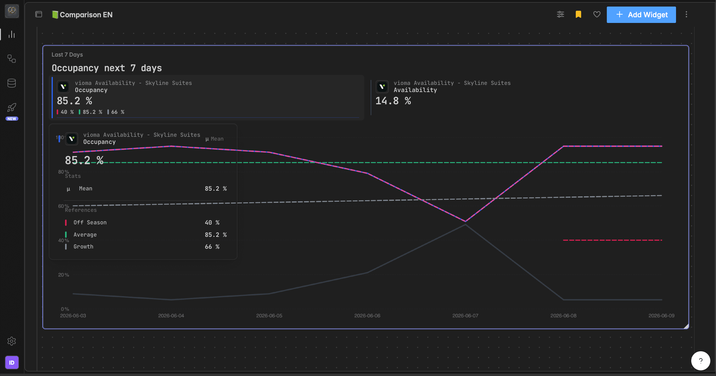
What is a comparison?
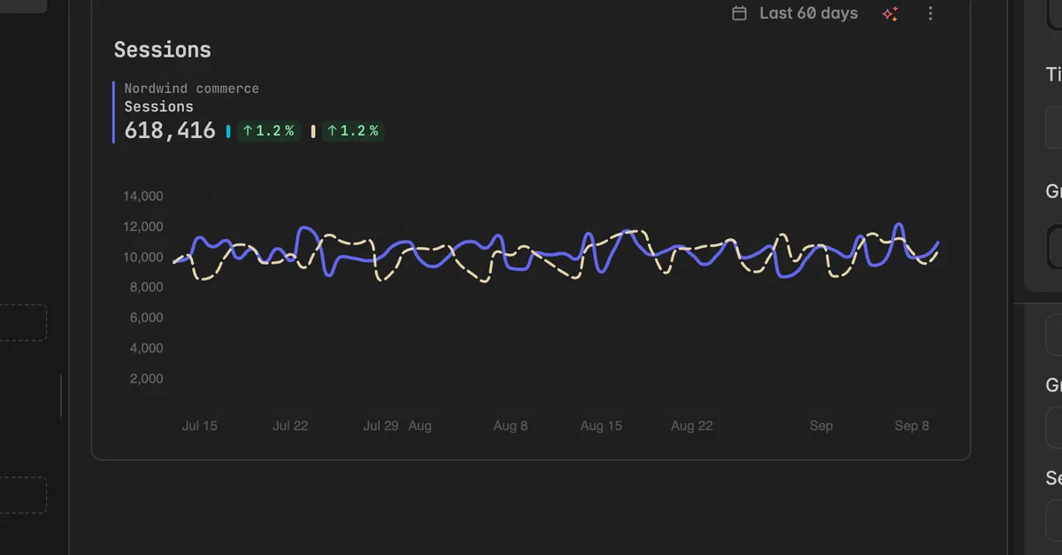
A comparison puts an earlier period next to a series, so the change shows on the widget. On a chart it is drawn as a dashed line beside the series, on a scorecard it appears as the change in percent under the headline number, and in a table it adds a column.
You add comparisons per series in the widget editor. A series can have several, for example the previous period and the same period last year. Each comparison has its own name, color, and a direction that tells Indicate whether a rise is good or bad.
Previous period: each point against the same point one period earlier. Good for week over week or month over month.
Same period, previous year: each point against the equivalent point a year earlier, so seasonal shape lines up. Good for year over year.
Against a guide line: judges the series against a target or average drawn on the widget. See Guide lines.
How do I add a comparison?
Editing needs at least the User role.
Open the dashboard and click the name of the widget. The widget editor opens on the right.
Scroll to the series and click Add next to Comparisons.
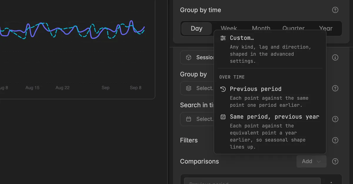
Pick Previous period or Same period, previous year. Pick Custom… to open the advanced settings and shape the comparison yourself, see below.
The comparison appears as a row under Comparisons and is drawn on the widget right away.
The widget on the board now shows the comparison. On a chart it is the dashed line, the header shows the change in percent.
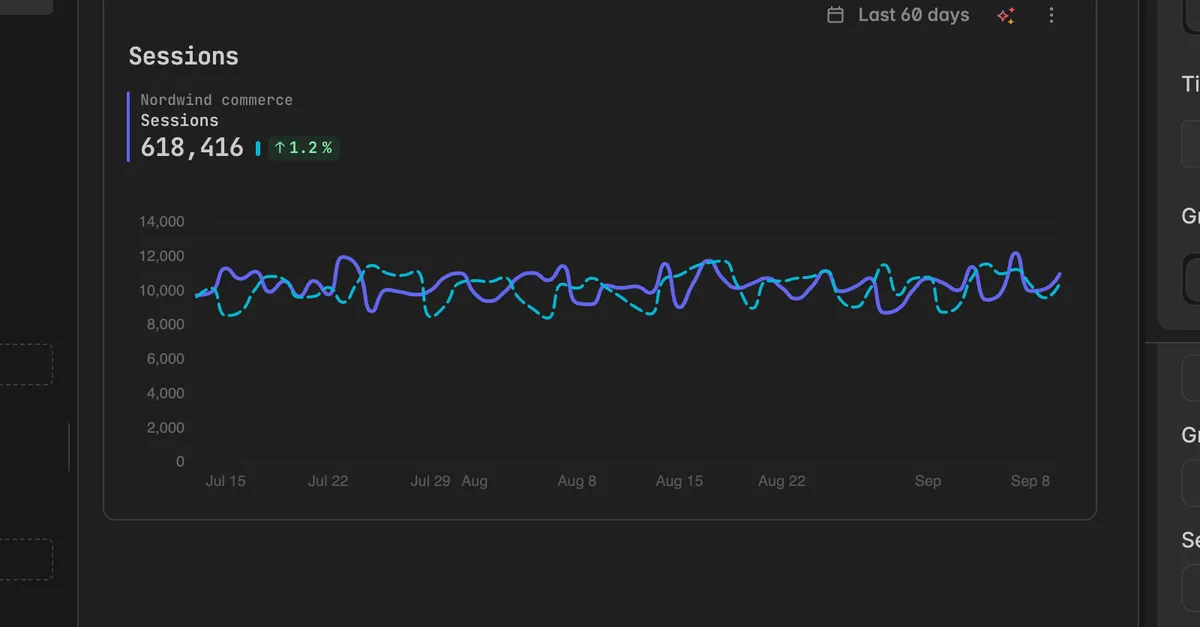
Repeat the steps to add a second comparison. Every comparison gets its own color, so the lines stay apart.
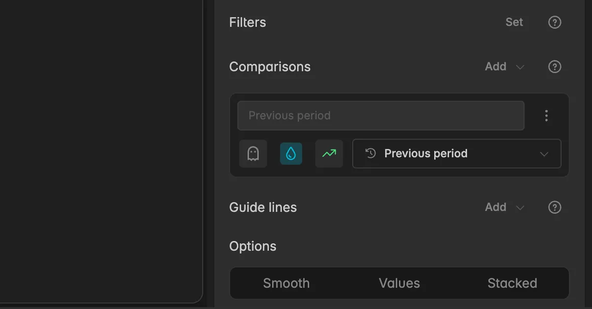
What is on a comparison row?
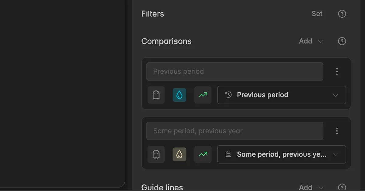
Comparison display name: the label shown in the legend and the tooltip. Leave it empty to use the name of the preset.
Ghost icon: hides the comparison without deleting it. Click again to show it.
Color drop: the color of the comparison line.
Direction: the arrow icon. Click it to say whether higher or lower is better, see the next section.
Compared with: the field that names the preset, for example Previous period. Click it to switch to another preset or to Custom….
⋮Comparison actions: Advanced settings and Delete.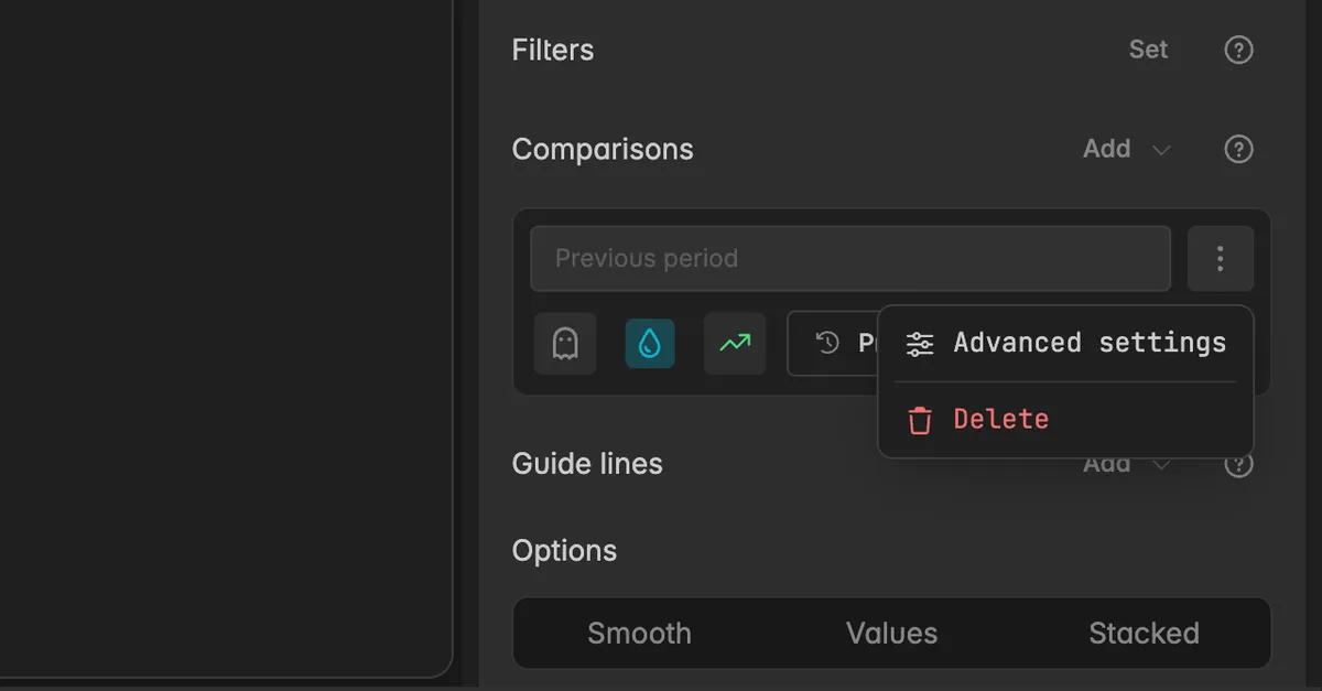
How do I set the direction?
The direction decides how the change is judged and colored. Click the arrow icon on the comparison row and pick:
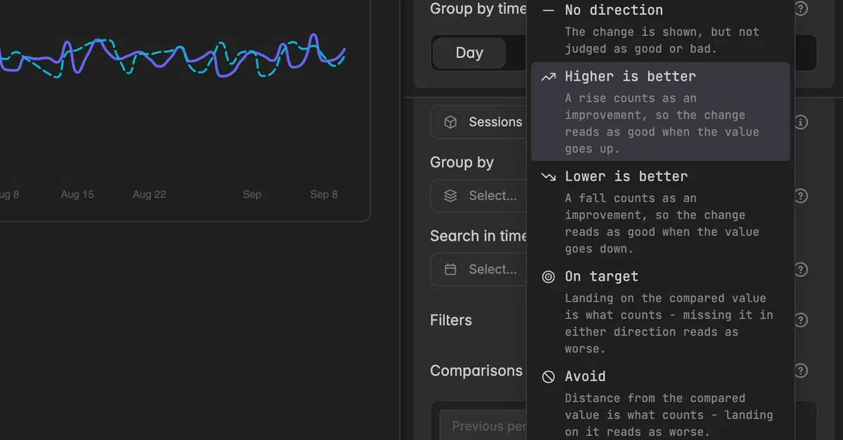
No direction: the change is shown, but not judged as good or bad.
Higher is better: a rise counts as an improvement, for example revenue or bookings.
Lower is better: a fall counts as an improvement, for example cancellations or cost per booking.
On target: landing on the compared value is what counts. Missing it in either direction reads as worse.
Avoid: distance from the compared value is what counts. Landing on it reads as worse.
How do I switch a comparison to another period?
On the comparison row, click the Compared with field.
Pick a preset from Over time. Once the series has guide lines, a second group Against a guide line lists them, so you can judge the series against its average or a target.
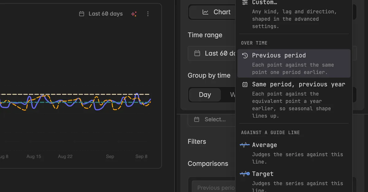
Pick Custom… for any other lag or kind.
How do I shape a custom comparison?
The advanced settings hold everything the presets do not cover: a lag of several periods, a different unit, or a tolerance band.
Click
⋮on the comparison row and select Advanced settings, or click Custom… when adding. The dialog Advanced settings opens on the Additional lines tab.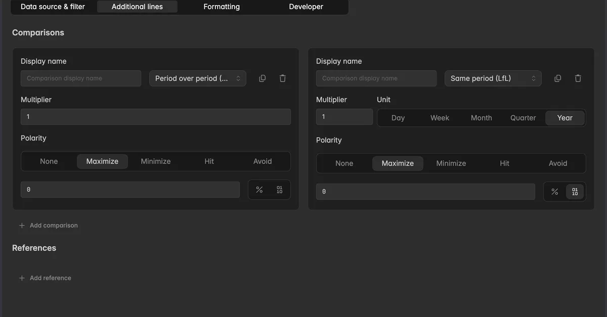
Set the fields of the comparison:
Display name: the label of the comparison.
Kind: Period over period (PoP) steps back by the length of the selected range. Same period (LfL) jumps to the same dates in an earlier week, month, quarter, or year. Reference compares against a guide line of this series.
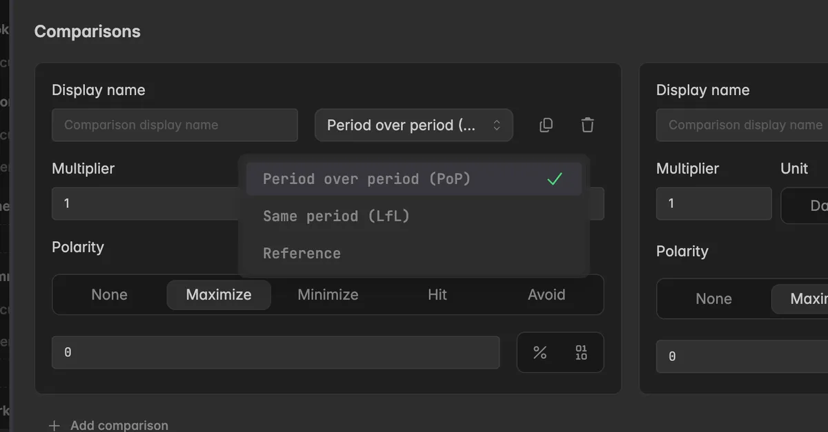
Multiplier: how many steps back.
1is the period directly before,2skips one.Unit: for Same period, the scope to jump back in: Day, Week, Month, Quarter, or Year.
Reference: for the Reference kind, the guide line to compare with.
Polarity: the direction, see above.
The field below the polarity is the tolerance. A change inside it counts as unchanged. Switch between percent and an absolute value with the buttons next to it.
Click Add comparison at the bottom of the section to add another one, or the trash icon to remove one.
Click Save. The row in the editor now reads Custom with a short description of what it does.
Note: Period over period and Same period answer different questions. With a range of 7 days, Previous period compares with the 7 days before, while Same period, previous year compares with the same 7 days one year ago. For seasonal businesses the second one is usually what you want.
Troubleshooting
The comparison line is missing
The compared period has no data. Same period, previous year draws nothing if the source has no data for last year. Widen the time range or pick Previous period.
It may be hidden. On the comparison row the ghost icon is highlighted. Click it to show the comparison.
The values look wrong
- Check the Kind and Multiplier in the advanced settings. Period over period steps back by the length of the range times the multiplier, Same period jumps to the same dates in an earlier unit.
The change is green although the value went down
- The direction is set to Lower is better. Click the arrow icon on the comparison row and pick Higher is better.
I compare with the previous week but wanted last year
- Switch the Compared with field to Same period, previous year, or set Kind to Same period (LfL) and Unit to Year in the advanced settings.
Against a guide line is not offered
- The series has no guide line yet. Add one under Guide lines first, then open Compared with again.
A calendar chart shows a warning about comparisons
- On a calendar chart comparisons overlay as stacked layers and are hard to tell apart. Switch the series to a line or bar chart for comparison views.
Was this helpful?