
Style a widget
Set series colors, hide a series, use display options like Smooth, Values, Stacked, or Donut, and reorder the series of a widget.
What can I style on a widget?
Styling changes how a series looks, not what it shows. Every series on a widget has its own color, can be hidden without deleting it, and has display Options that depend on its visualization, for example Smooth and Stacked for a line or Donut for a pie. Series are drawn in the order they are listed, and you can reorder them.
All of this lives in the widget editor. Open the dashboard, click the name of the widget, and scroll to the series. Changes save on their own and appear on the board right away. Editing needs at least the User role.
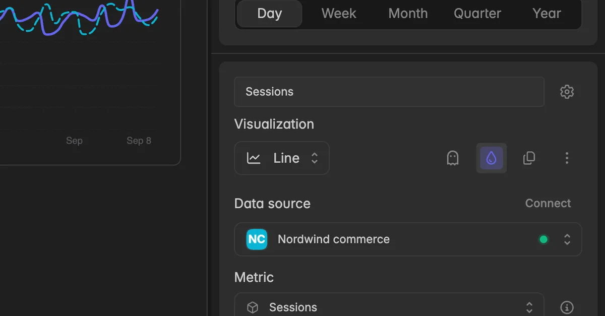
The header of each series holds, from left to right: the Visualization field, the ghost icon to hide the series, the color drop, the copy icon to duplicate the series, and the ⋮ menu.
How do I change the color of a series?
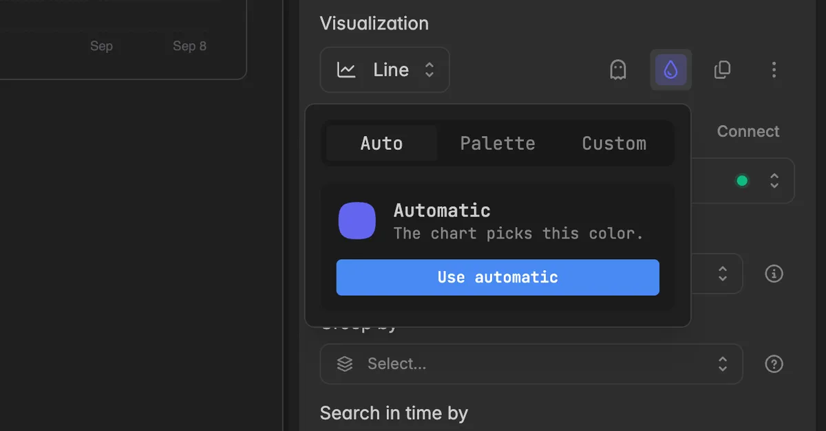
In the widget editor, click the color drop in the header of the series.
Pick one of the three tabs:
Auto: the chart picks the color. Click Use automatic to go back to it.
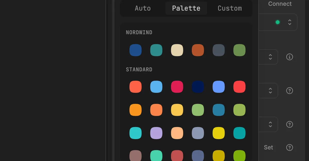
Palette: click a swatch. Standard is the built-in set. Above it you see your brand palettes, if your space has any.
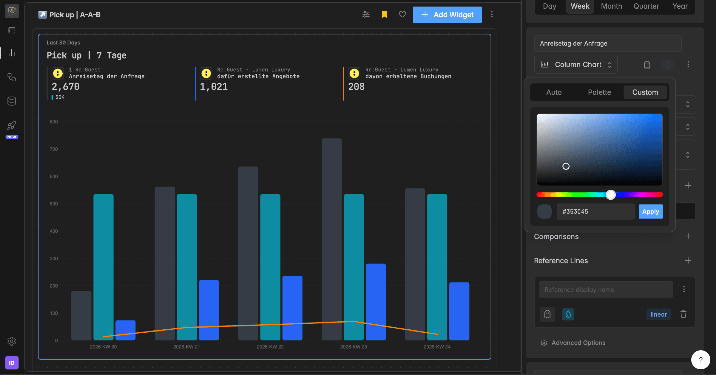
Custom: pick a color in the field, drag the hue slider, or type a HEX value such as
#6366F1, then click Apply.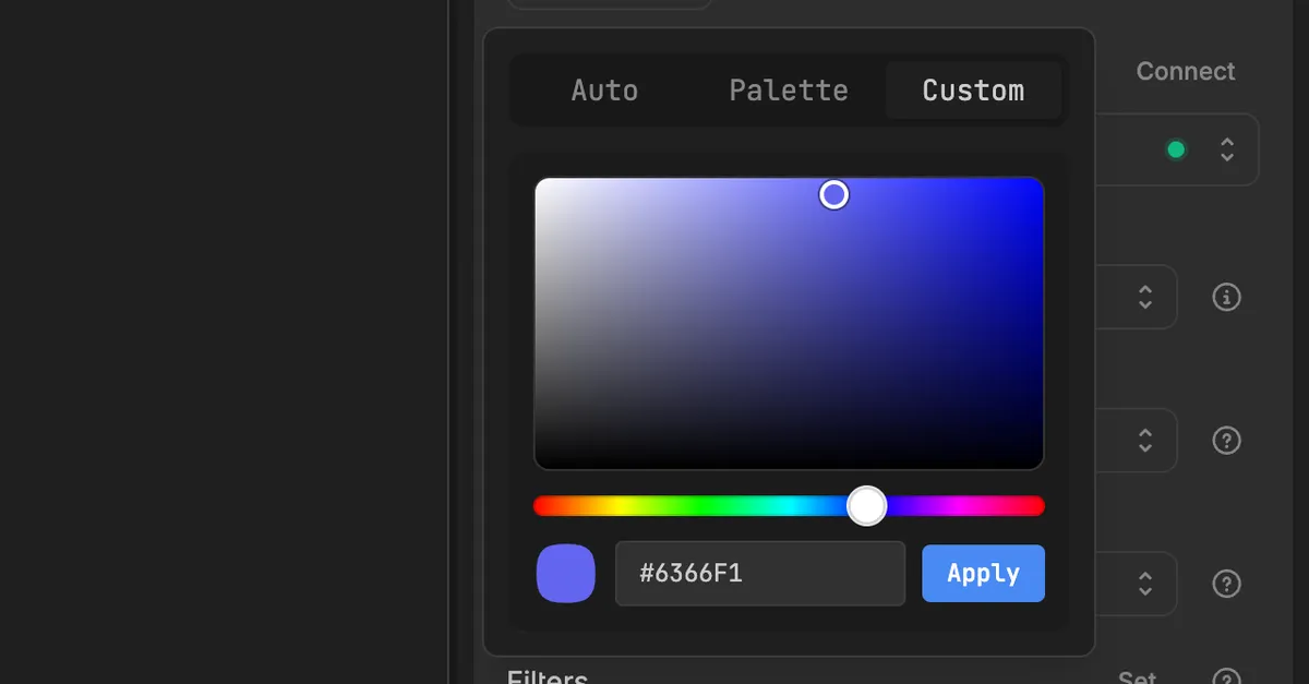
The new color is used in the chart, the legend, and the tooltips. Comparisons and guide lines have their own color drop and are set the same way.
Note: Brand palettes let you define your company colors once and pick them in every widget. They come with the Pro plan and are set up under
Settings→Brand, see Brand palettes. Without a brand palette the Palette tab shows No brand palettes yet.
How do I hide a series without deleting it?
Use this to simplify a chart for a presentation or to park a series you may need again. Nothing is lost: the color, filters, and comparisons stay saved.
In the widget editor, click the ghost icon in the header of the series. The tooltip reads Hide this series.
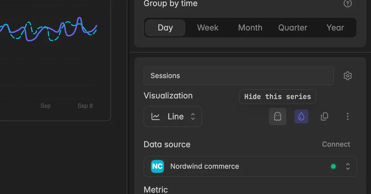
The series disappears from the chart and the header. The icon stays highlighted while the series is hidden, and the widget header shows an
iicon with 1 of 2 series shown.Click the icon again, now Show this series, to bring it back.
Before: a widget with two series, Sessions and Sessions copy, both drawn and both listed in the header.
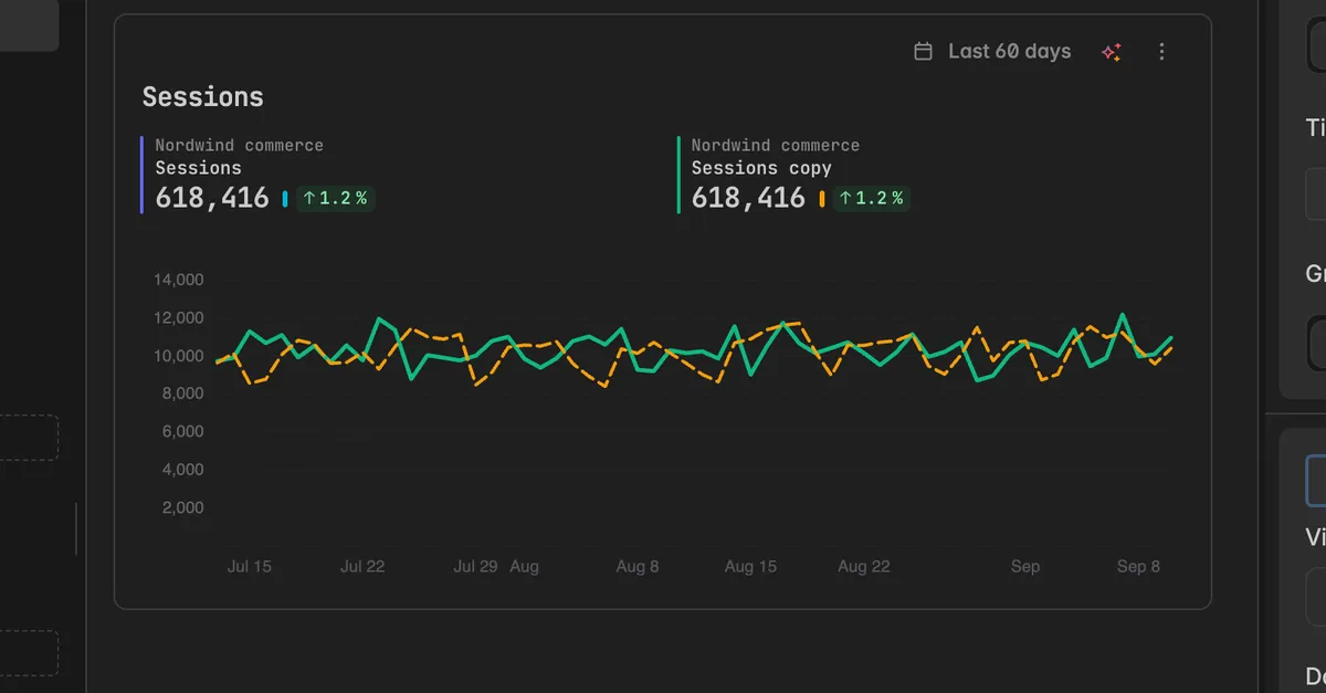
After: the second series is hidden. Only Sessions is drawn, the header lists one series, and nothing about the hidden series is lost.
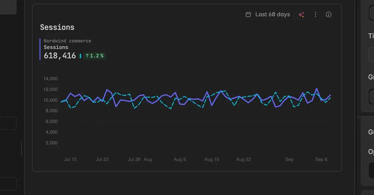
In the editor the hidden series keeps its block, only the ghost icon is highlighted:
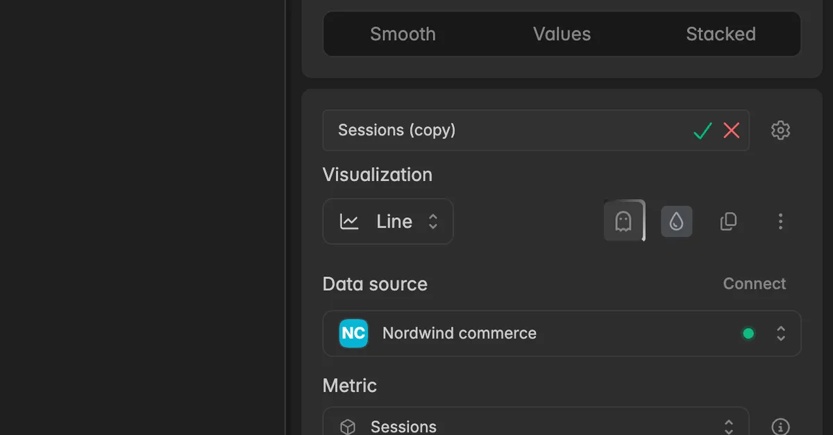
Comparisons and guide lines have the same ghost icon on their row. Hide a comparison to take the dashed line and the change badge off the chart for a moment, for example for a screenshot, without losing its setup:
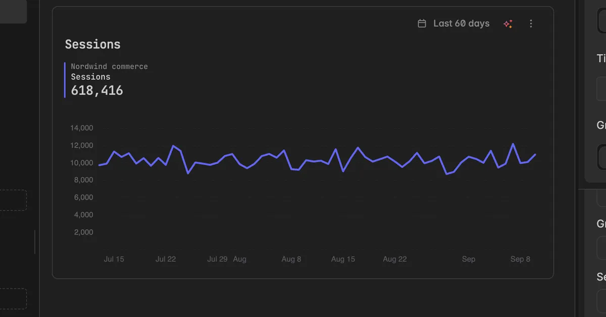
You can hide as many series, comparisons, and guide lines as you like. If every series is hidden, the widget shows an empty chart with its title.
What display options are there?
The Options row sits below the guide lines of each series. Which switches you see depends on the Visualization of that series.
Line and area
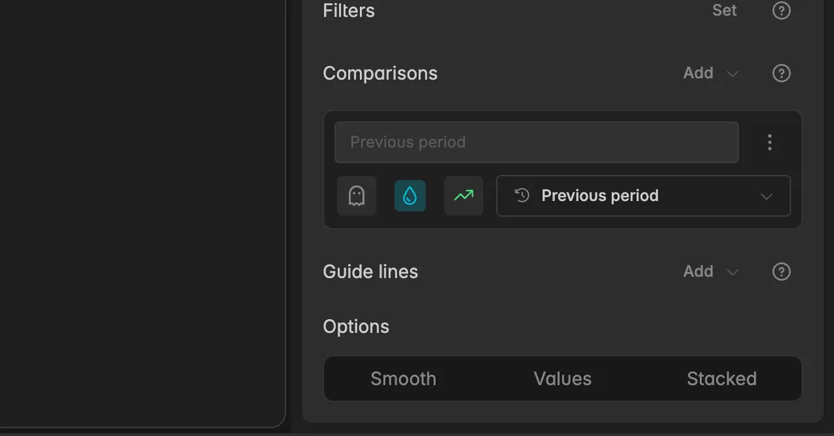
Smooth: draws curved instead of straight lines. It only changes the drawing, not the values. It works best with many data points.
Values: prints the value at every point. Works best with a coarser Group by time, here Week, so the labels have room.
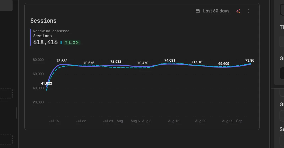
Stacked: stacks this series on top of the series above it, so the chart shows the total and how each series contributes.
Bar and column
Values: prints the value on every bar.
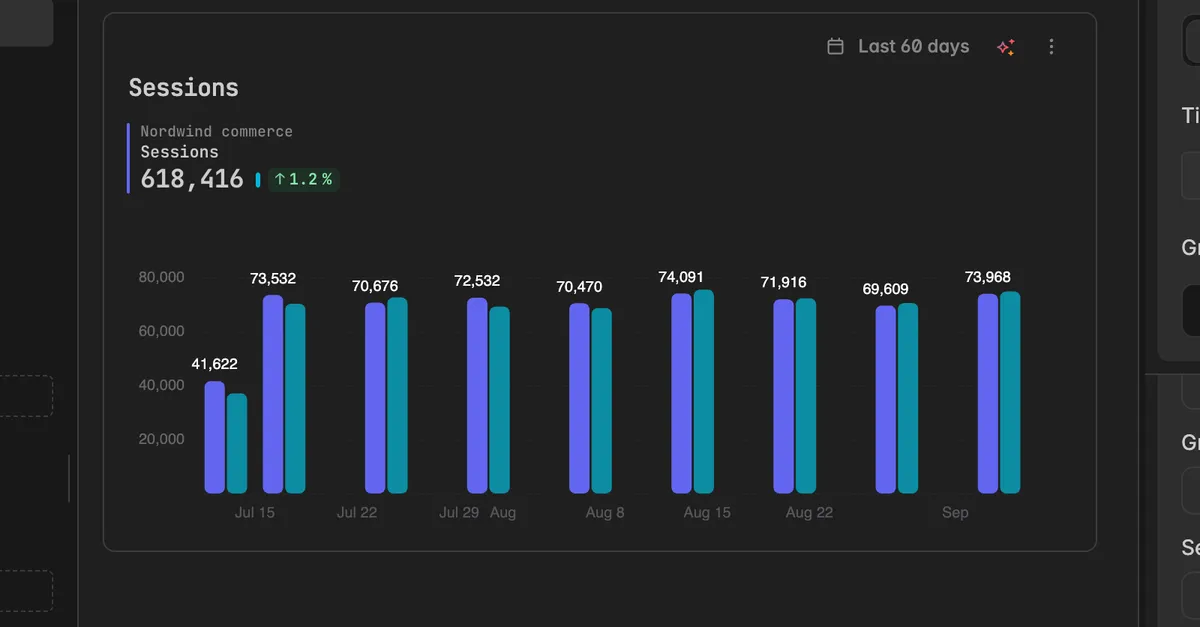
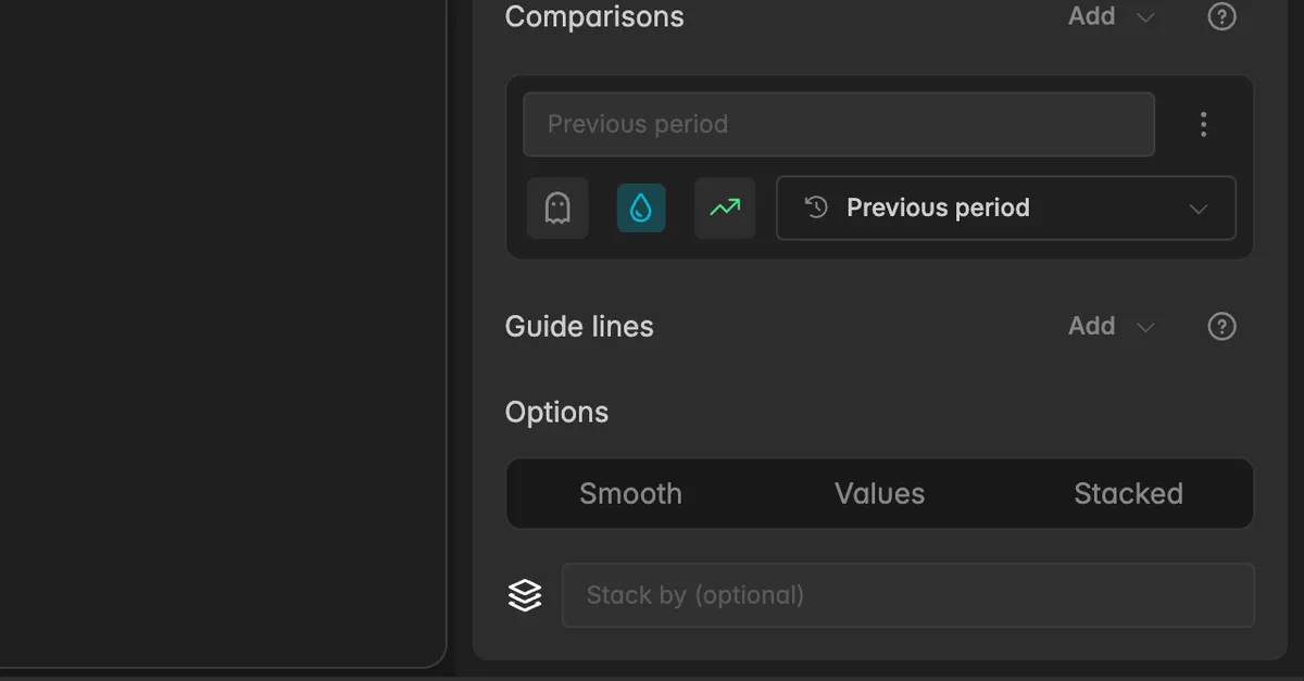
Stacked: stacks this series on the series above it.
Stacking groups
When Stacked is on, a field Stack by (optional) appears. Type a group name to control what stacks with what: series with the same name stack together, series with another name form a second stack next to it.
Pie
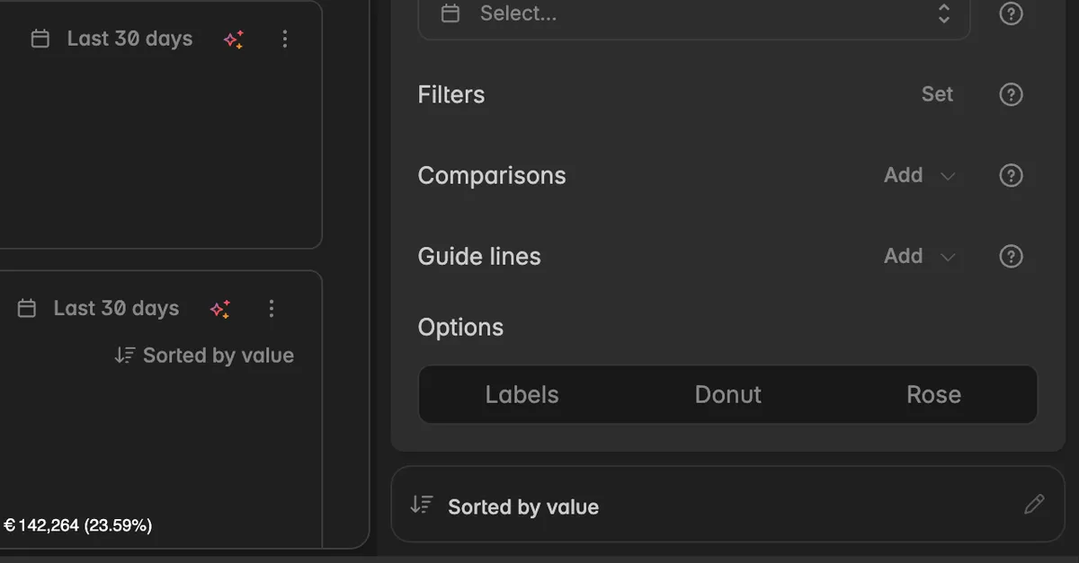
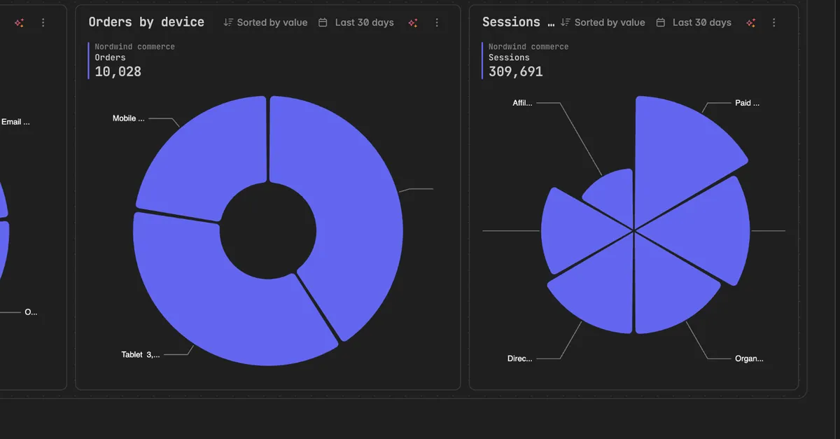
Labels: shows the value and share on each slice.
Donut: draws the pie with a hole in the middle.
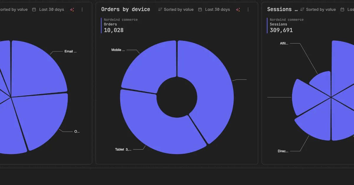
Rose: slices grow outward with their value as well as around, so a big share is a big slice in both directions.
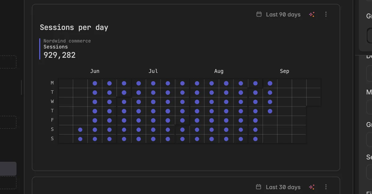
Calendar
Without any option, each day gets a dot sized by its value.
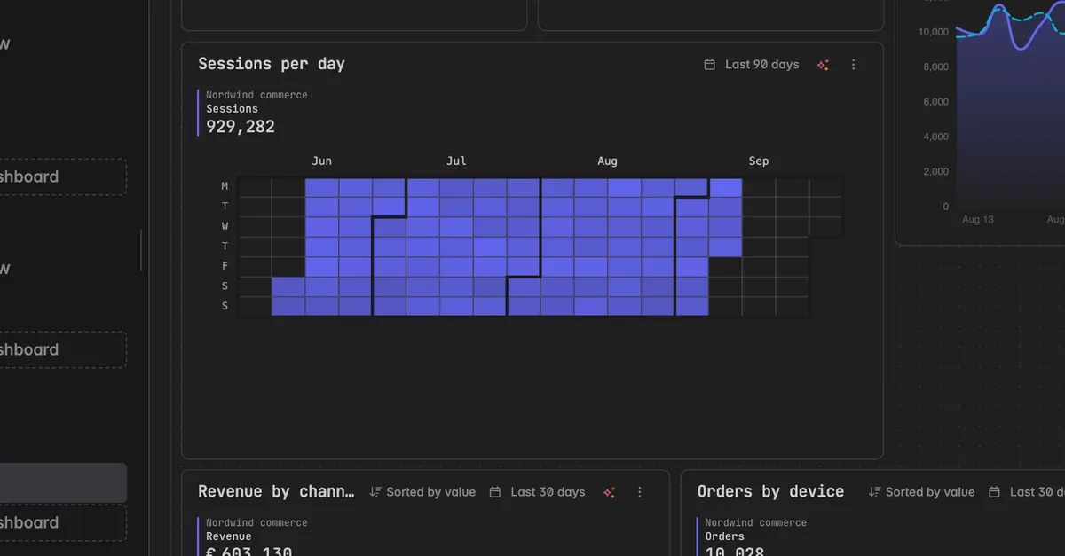
Heatmap: colors the days on a scale from low to high, so busy days stand out at a glance.
Values: prints the value on each day. Combine it with Heatmap to read the exact number behind each color.
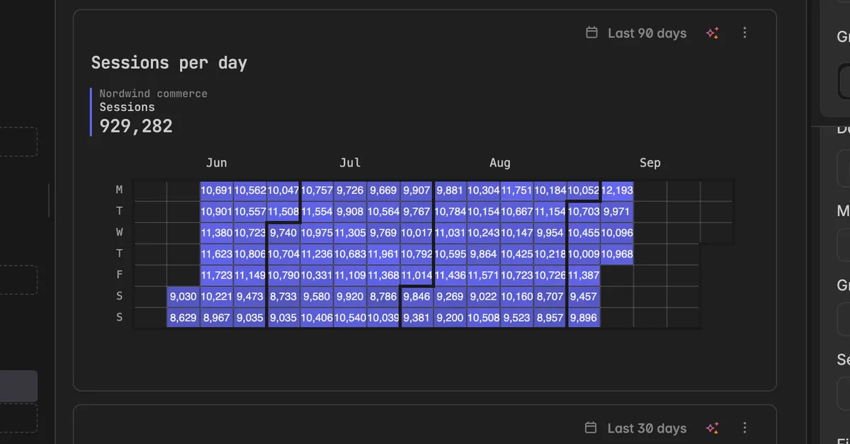
Table and scorecard
A table offers Total and Mean rows, a scorecard chooses between Last, Sum, and Mean. See Change widget type.
Note: Options apply per series. On a widget with several series, set Stacked or Values on each series you want it on.
How do I change the order of the series?
The order decides how the series are drawn and listed in the legend. The first series is drawn first, so a stacked chart builds from it.
In the widget editor, click the reorder icon next to Add series. It only appears once the widget has more than one series. You can also open the
⋮widget menu and select Reorder series.In the dialog Reorder series, drag a series to a new place, or use the arrows on its row.
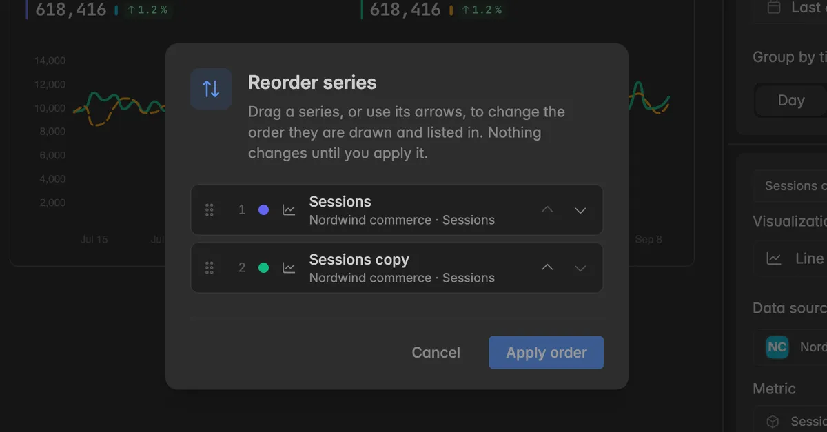
Click Apply order. Nothing changes until you do.
Troubleshooting
Two series have the same color
- With Auto the chart assigns colors and can repeat them on busy widgets. Pick a Palette or Custom color for each series.
A series is missing from the chart
It is probably hidden. In the editor the ghost icon in its header is highlighted. Click it to show the series again.
If the series is shown but empty, its data source or metric is incomplete. See Manage widget data sources & Metrics.
Smooth, Stacked, or Labels is not there
- The switches depend on the visualization. Smooth is for line and area, Stacked for line, area, bar, and column, Labels, Donut, and Rose for pie, Heatmap for calendar. Change the Visualization of the series.
The Palette tab shows no brand palettes
- Brand palettes are a Pro feature and have to be set up in
Settings→Brandfirst, see Brand palettes. The Standard swatches and Custom colors work on every plan.
Values make the chart unreadable
- On dense charts with many points the labels overlap. Turn Values off, widen the widget, or set Group by time to Week or Month so there are fewer points.
Was this helpful?