
Create a dashboard
A dashboard is your visual canvas for widgets, charts and KPIs. Learn how to create one, empty or built by AI from a prompt.
What is a dashboard
A dashboard in Indicate is a visual canvas where you combine widgets, charts, and KPIs into a single view. Each dashboard belongs to a project and is visible to everyone in your space.
There are two ways to create a dashboard. Both start on the same page:
Without AI: you start with an empty dashboard and add widgets by hand.
With AI: you describe what you want to see, and Indicate builds the widgets from your connected sources.
Once a dashboard exists you can rename it, add a description or delete it.
How do I open the create page?
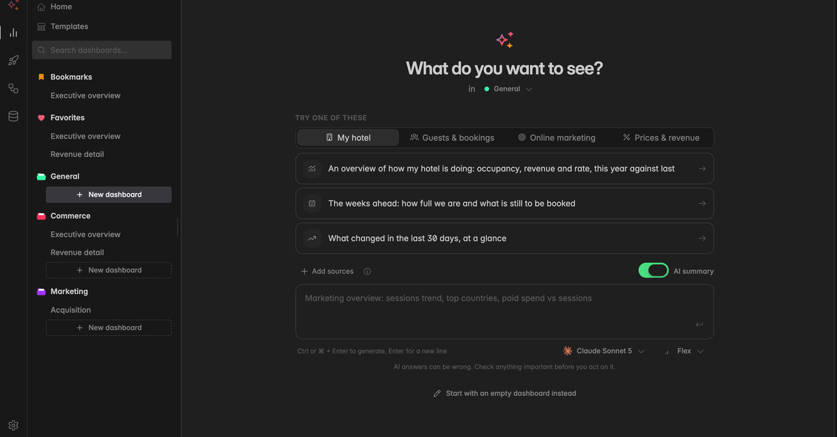
Go to Analytics. Creating a dashboard opens the page What do you want to see?. There are three ways to get there:
In the left sidebar, click + New dashboard at the bottom of the project you want the dashboard in.
In the left sidebar, hover over a project name, click the
⋮icon that appears and select Create dashboard.On the Home page, click New dashboard at the top.
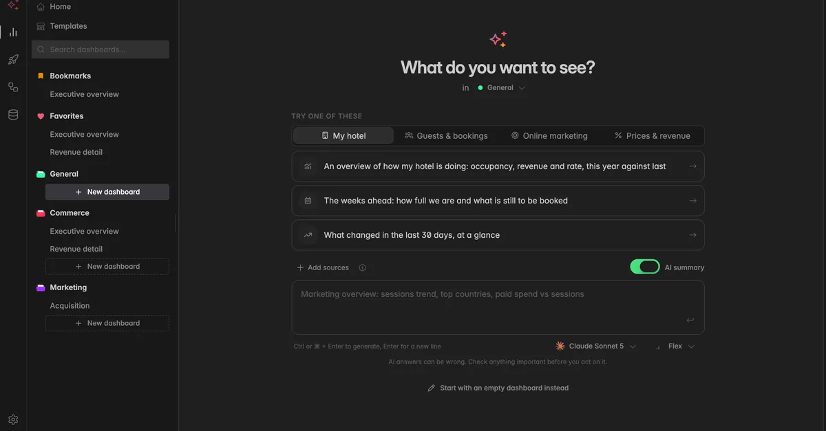
The page opens with the AI prompt. Below the heading you see in [Project], which tells you where the dashboard will be created. Click the project name to pick another project, or select New project… to create one first.
Option 1: Create an empty dashboard without AI
Use this route when you want to build the dashboard yourself, widget by widget.
Open the create page as described above.
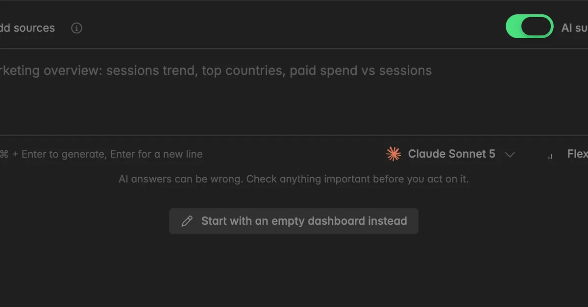
Scroll to the bottom of the page and click Start with an empty dashboard instead, right below the prompt field.
The form Name your dashboard opens. Enter a Display name, for example "Marketing Overview". The name needs between 3 and 128 characters.
Optionally, enter a Description. It is shown next to the name in the dashboard toolbar. You can add or change it later.
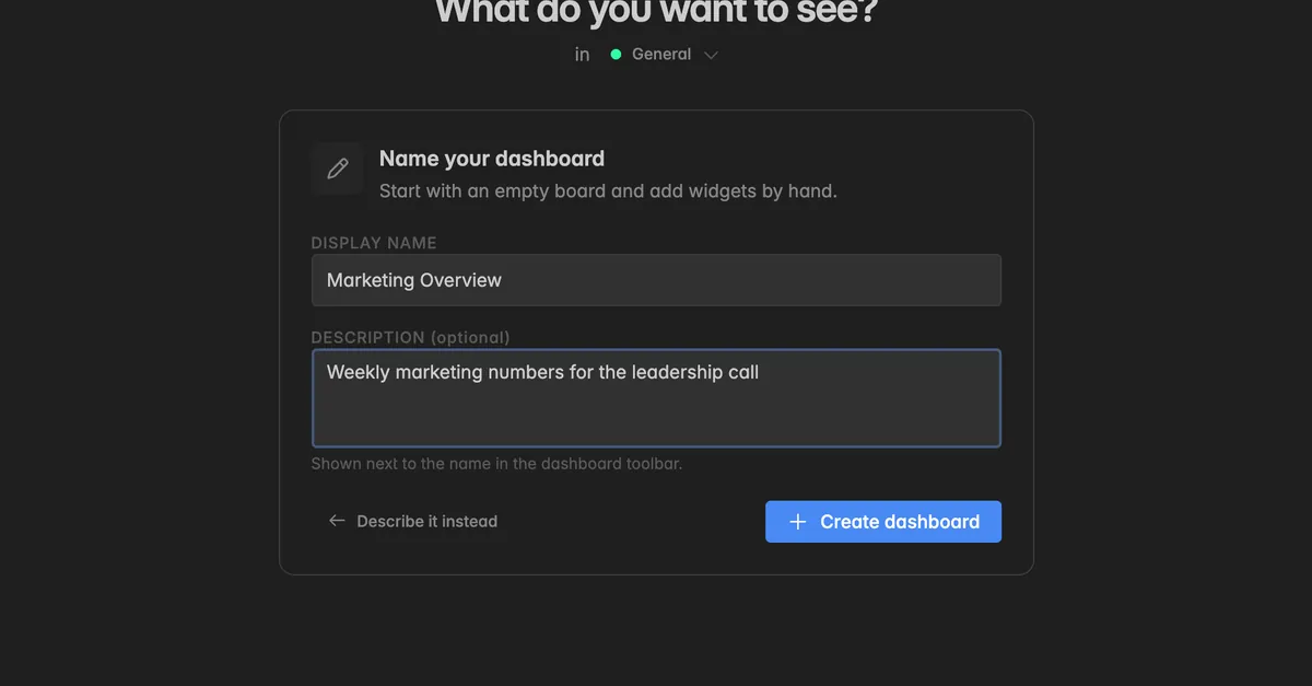
Click Create dashboard. The dashboard opens and appears in the left sidebar under your project.
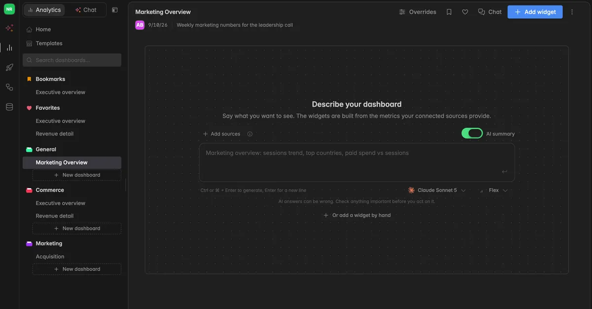
Click Add widget in the toolbar to fill the dashboard. See Create a widget.
Note: An empty dashboard still shows the AI prompt on its canvas. You can use it at any time later, and you can add, edit, and remove widgets by hand in both routes. Click Describe it instead on the form to go back to the prompt.
Option 2: Build a dashboard with AI
Use this route when you want a first version in a minute instead of building ten widgets by hand, or when you know what you want to see but not which metric in which source delivers it.
The AI does not invent numbers. It only assembles widgets from the metrics your connected data sources already provide, which is why the result is as good as the sources you have connected.
Note: AI can make mistakes. The widgets and the summary are generated by AI and may be incomplete or inaccurate. Always check the underlying figures before you make decisions based on them.
Open the create page as described above. The AI prompt is already selected.
Above the prompt, click Add sources and select the Insights the dashboard should use, for example
Nordwind commerce. Press Esc to close the list.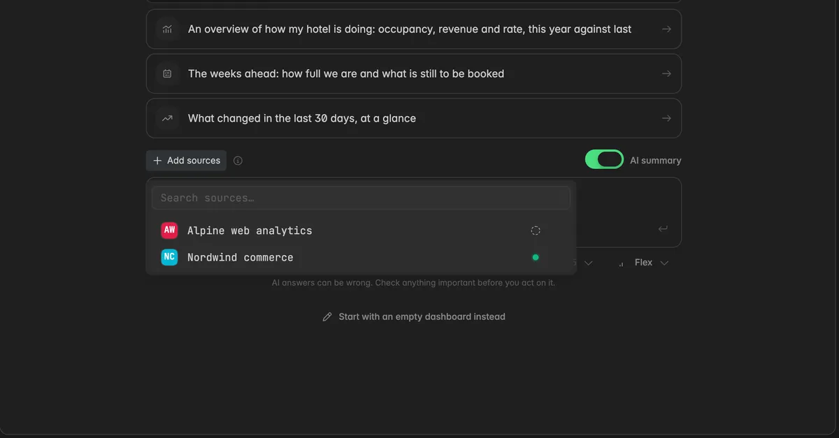
Leave the AI summary toggle on if you want a written summary above the widgets. Turn it off to generate the widgets only.
Click the Dashboard description field and describe what you want to see. Write it in your own words, in full sentences or as a list. Under Try one of these you find example prompts by topic, click one to use it.
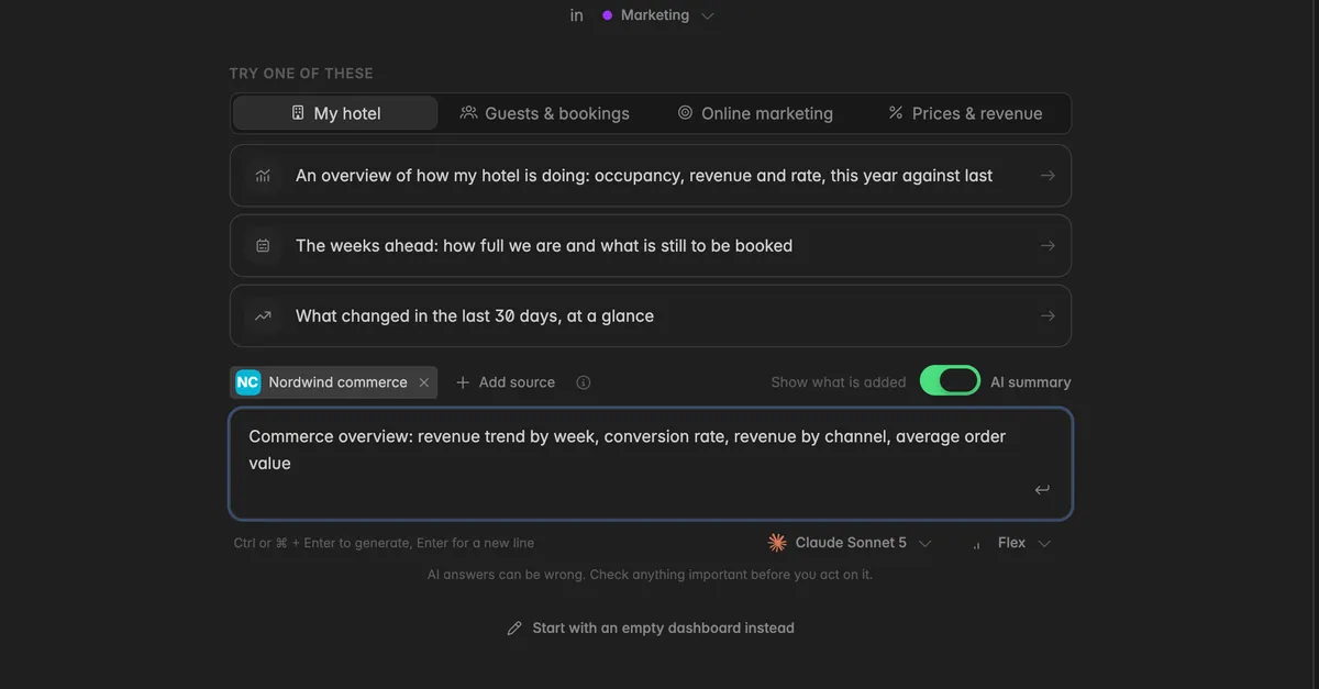
Optionally, pick a Model and an Effort level below the field. The section Which model and effort should I pick? below explains the options.
Click the Generate arrow at the end of the field, or press
Ctrl+Enteror⌘+Enter.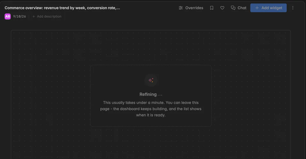
The dashboard opens right away and shows a progress card while the AI works. This usually takes under a minute. You can leave the page, the dashboard keeps building and the sidebar shows a sparkle icon next to it until it is ready.
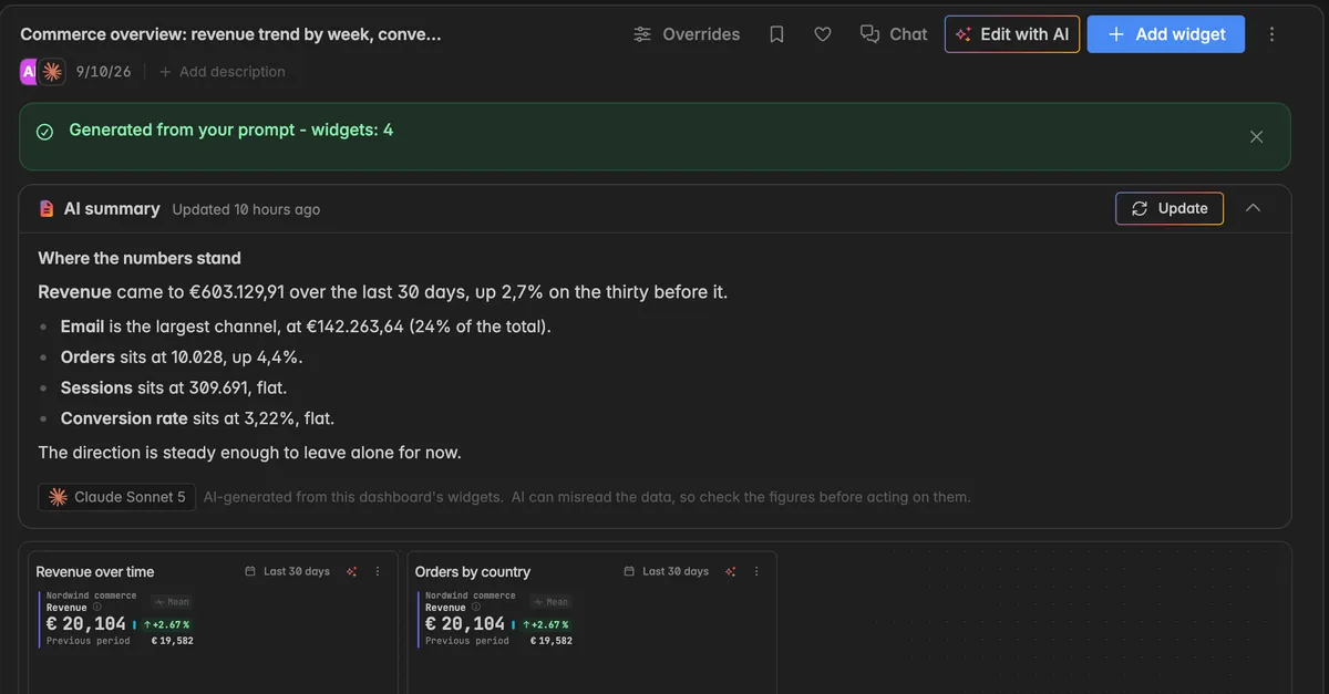
When the AI is done, a green banner tells you how many widgets were created, for example Generated from your prompt - widgets: 4. Indicate also writes a title and a short description for the dashboard, both based on your prompt. You can change both at any time, see Rename a dashboard.
Note: A prompt can hold up to 8,000 characters, including the sources you picked. A counter appears below the field once you get close to the limit, for example
6,500 / 8000 (incl. sources). If you are over the limit, shorten the prompt or remove a source.
How do I write a good prompt?
The prompt decides what you get, so name the figures you want and how you want them broken down. The example under the field shows the pattern well:
Marketing overview: sessions trend, top countries, paid spend vs sessions
What works:
Name a topic and then the figures. "Website analytics: visitors, actions, bounce rate, visitors by device."
Say how to break it down. "by country", "by week", "per campaign" turns a single number into a chart.
Ask for comparisons. "paid spend vs sessions" puts two figures next to each other.
Start from an example. Under Try one of these, pick a topic such as Online marketing and click a suggestion. It lands in the field and you can adjust it.
What does not work:
Asking for data that none of your sources deliver. The AI can only use metrics that exist in your connected sources.
Very vague prompts such as "show me everything". You get a generic board that you then have to rework.
Why should I pick sources?
Picking the sources is optional in most spaces, but it changes the quality of the result. It lets the AI draw from the right Insights, which uses less of your prompt limit and improves the result. You still describe what you want in the prompt, the sources only narrow down where it is built from.
With sources picked: the AI works with the metrics of those Insights only. Faster, cheaper, and closer to what you meant.
Without sources picked: the AI has to consider everything connected in your space, which uses more of the prompt limit and can pull in metrics you did not have in mind.
Pick the source that owns your topic. For a website dashboard that is your web analytics source, for an advertising dashboard your ad platform.
Click Show what is added next to the sources to see the metric list the AI receives for your picks. Hover the info icon next to Add sources for the same explanation inside the app.
Note: In a space with more than 10 sources, picking is required. The button reads Pick sources to build from and Generate stays disabled until you have picked at least one.
Which model and effort should I pick?
Below the prompt field you see two pickers. They decide which AI model runs your request and how much effort it spends on it. Both also apply to Edit with AI and to widgets built with AI.
Model
Click the model name, for example Claude Sonnet 5, to open the list.
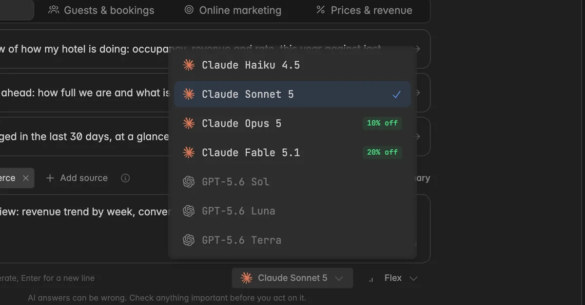
Available models are shown with their provider. Models that are not available yet are greyed out.
Some models carry a discount badge, for example
10% off. The discount applies to the AI budget this request uses.
Effort
The Effort picker only appears for models that support it.
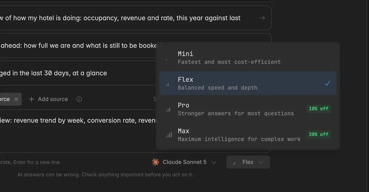
Mini is the fastest and most cost-efficient. Flex balances speed and depth and is the default. Pro gives stronger answers for most questions. Max uses maximum intelligence for complex work.
Higher effort costs more of your AI budget. Start with Flex and raise it only when the result is not good enough.
Your effort pick is remembered on this device and used for the next prompt.
What does the AI summary show?
Above the widgets, the dashboard carries a card AI summary with a written read of the current data. It is the part that answers "and what does that mean", which charts alone do not.
The summary reads the same numbers the widgets show and describes them: what the key figures did in the period, what stands out, and what to look at next. Below the text you see which model wrote it.
The card shows when the summary was written, for example
Updated 9 hours ago.Click Update to write it again against the current data. If no summary exists yet, the button reads Generate AI summary.
Click the arrow at the right of the card to fold the text away. The card itself stays on the dashboard.
Members with the Reader role see the summary but cannot generate or update it.
Note: The summary is a reading of your numbers at that moment. After the next data load, or after you change widgets, click Update so the text matches what the dashboard now shows. Each summary is a separate AI call and uses AI budget.
How do I change a dashboard with a prompt?
You do not have to edit widget by widget. The same prompt mechanism can rework an existing dashboard.
Open the dashboard and click Edit with AI in the toolbar at the top right. A prompt panel opens below the toolbar.
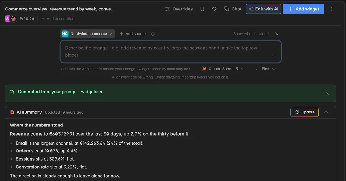
Check the sources at the top of the panel. The sources of the dashboard are already picked. Click Add source to add more, or the
xon a source to remove it.In the field Describe the change, say what should be different. The placeholder shows the range:
add revenue by country,drop the sessions chart,make the top row bigger.Optionally, change Model and Effort below the field.
Click the Apply arrow at the end of the field, or press
Ctrl+Enteror⌘+Enter.
While the AI works, widgets cannot be moved, resized, or changed with AI. Click the x at the top right of the panel to close it.
Note: A change prompt rebuilds the whole board around your change, so widgets you built by hand can be redesigned in the process. If you want to keep a widget exactly as it is, duplicate the dashboard first, see Duplicate a dashboard.
To change a single widget instead of the whole board, use the sparkle icon Change this widget with AI in the widget header. To add a single widget with a prompt, click Add widget and choose Let AI build it.
Troubleshooting
I can't create a dashboard
The Display name needs at least 3 characters and at most 128 characters. Adjust the name and try again.
Creating dashboards requires at least the User role. Users with the Reader role can view dashboards but cannot create them. On the create page they see the message Edit rights needed. Ask your space admin to update your role.
I don't see + New dashboard in the sidebar
- Dashboards live in projects. If your space has no project yet, the sidebar shows No dashboards yet. Click New project at the bottom of the sidebar first. Clicking New dashboard on the Home page also opens the project dialog first in this case.
I don't see Start with an empty dashboard instead
The button sits at the very bottom of the create page, below the prompt field. Scroll down if your window is small.
If the page shows Connect your data instead of the prompt, your space has no data source yet. Ask a space admin to connect one, see Add a data source.
I can no longer create dashboards with AI
Your space has used its AI budget for this period. The prompt shows the message
This space has used its AI budget of ... for this periodtogether with the reset time. Click the AI budget icon at the bottom of the left navigation to see how much is left and when it resets.Go to
Settings→Billing→AI usageto see the budget, the current period, and every AI call behind it.If you need a higher AI budget, contact support through our request form.
The message says AI features are not included in my plan
- AI dashboard generation is part of a higher plan. Go to
Settings→Billing→Planto upgrade. You can still create empty dashboards and add widgets by hand.
Generate is disabled although I typed a prompt
Your space has more than 10 sources, so you have to pick at least one under Pick sources to build from.
Your prompt is over the limit of 8,000 characters. Shorten it or remove a source.
Something is already being generated on this dashboard. Wait until it finishes, then try again.
The dashboard is missing a figure I asked for
- The metric probably does not exist in the sources you picked. Check the source article for that integration to see which metrics it delivers, then either pick another source or add the widget by hand.
Widgets show no data
- The AI built the widget correctly, but the source has no values for that period. Set the time range to a longer window and check whether data appears.
The result is not what I meant
Make the prompt more specific and generate again. Name the figures and the breakdown you want instead of the topic alone, and pick the source that owns the topic.
Raise the Effort to Pro or Max, or pick a stronger model.
Nothing in my prompt could be matched to my data
- The AI found no metric in your sources that fits the prompt. Name the metrics and sources you want to see, for example "revenue by channel from Nordwind commerce".
My hand built widget was changed after a prompt
- That is expected. A change prompt rebuilds the whole board. Work on a duplicate when you want to protect manual work.
The summary does not match the widgets
- The summary was written at an earlier point in time. Click Update in the AI summary card to write it against the current data.
Rename a dashboard
Change the display name of a dashboard directly in the toolbar or through the Edit dialog.
Add a description to a dashboard
Explain what a dashboard is for with a short description, added while creating it, inline in the toolbar, or in the Edit dialog.
Delete a dashboard
Remove a dashboard and its widgets from the sidebar or from inside the dashboard. Insights and data stay untouched.
Was this helpful?